

Monday, August 11
Tuesday, July 15


Monday, June 2

Thursday, May 22

Monday, May 12

Monday, April 28
touch/bases
in a courier mood.
here is something i wrote. it is my design philosophy/statement of sorts.
pre·pared
–adjective
1. properly expectant, organized,or equipped; ready.
“The hike, the wilderness journey, the camping experience--—this is never haphazard business.”
Preparations are carefully made, the planning imagery. The process of design is one wrought with pitfalls of misuse and misinterpretation. Like when in the Great Outdoors, one needs to be prepared to deal with all sorts of wrathful elements in order to breathe easy and take in the beauty. You cannot appreciate design if it kills you to make.
A designer cannot afford to be only an artist and shouldn’t think him/herself as such. In order to know our field we must first know the world; its history and people. One must be conscious and concerned, or otherwise be stuck—ill-fated with a fleeting perspective. A general knowledge is paramount to know what is appropriate and how to skew the limits of ordinary perception.
Friday, April 11
six/see

the sixth and final poster.
based off of the ishihara color blindness test but is more about putting the pieces together; molecules and things.
Thursday, April 3


Monday, March 24
cow/boy

this is poster number four.
process colors cyan, magenta, yellow, black
viz. design is a process.
Thursday, March 13
post/her three

this is poster number three (three colors) simple enough.
the typeface is adobe caslon pro italic and bold, respectively.
we're halfway.
Saturday, March 1
post/her

this is poster number two (of six) comprised of two colors (duh), warm grey 7m and black. the typeface is univers condensed and condensed-light, respectively.
the concept is: to be greater than the old/tired design out there. the old guy represents that i suppose.
four more to go.
Wednesday, February 20
post her/

Friday, February 8

Monday, January 14
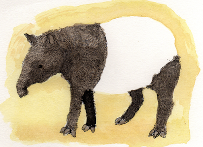
the tapir is
So I've been wanting to do more with this blog lately, like I want to write these interesting meaningful things but they aren't there right now.
Anyway, since I can't really come up with anything to write I drew a Malaysian Tapir.
Wednesday, January 2

Subscribe to:
Posts (Atom)